
Core Components, Part 2
Picking up where we left off
We successfully built an awesome infinitely-scrolling image feed. Next, we're going to add a new screen to the same app for commenting on images.
This is a code checkpoint. If you haven't been coding along with us but would like to start now, we've included a snapshot of our current progress in the sample code for this book.
If you haven't created a project yet, you'll need to do so with:
$ expo init image-feed --template blank@sdk-33 --yarnThen, copy the contents of the directory
image-feed/1from the sample code into your newimage-feedproject directory.
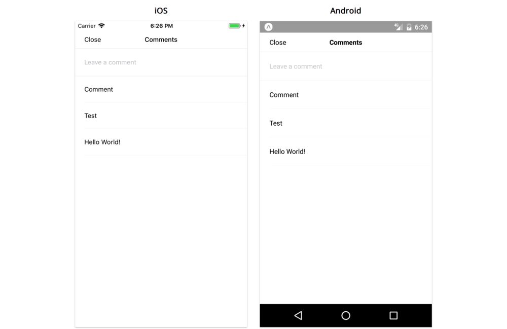
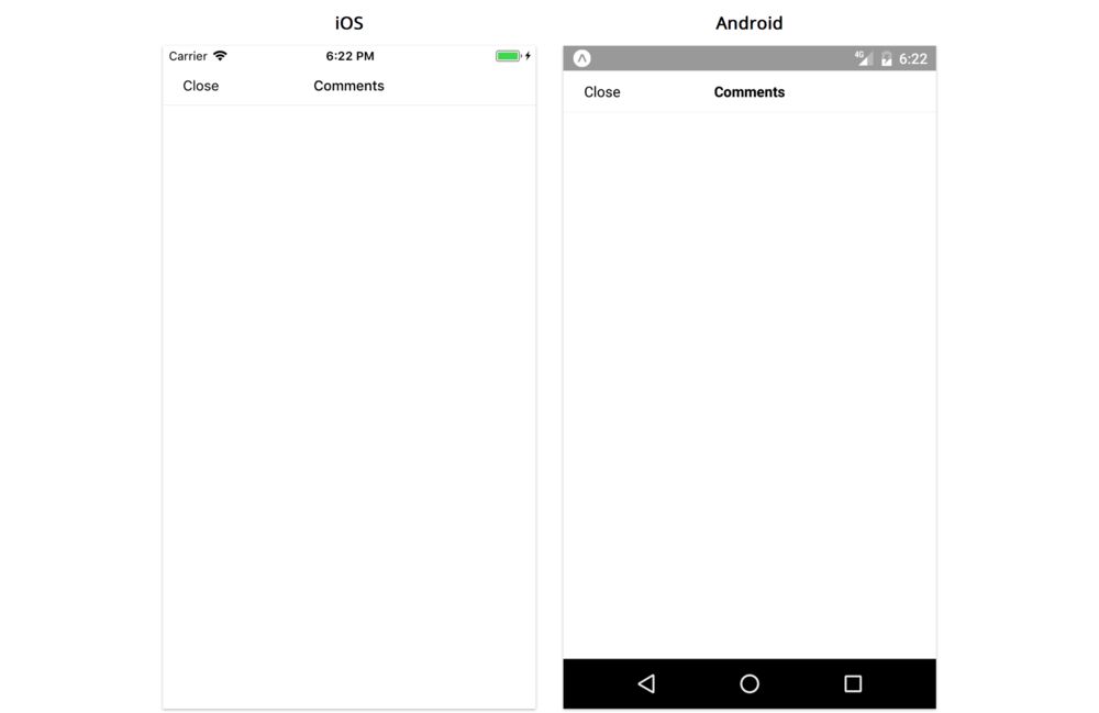
Comments
Here's what the comments screen will look like:
To build this portion of the app, we'll learn how to use the TextInput, ScrollView, and Modal components. We'll also cover a few other topics like AsyncStorage. We'll make a few assumptions so we can focus on built-in components:
- we won't use a navigation library even though we have multiple screens (more on navigation in later chapters)
- we only want to store comments locally on the device, rather than remotely via an API
- comments can be saved as simple strings (no
id,author, or other metadata) - the comment input field is at the top of the screen, to avoid complexities around keyboard and scrolling (which we'll cover in the next chapter)
- there are few enough comments that a
ScrollViewwill be performant enough (rather than using aFlatList)
Breaking down the comments screen
The first thing we'll want to do is break the screen down into components. Here's one way we can break it down:
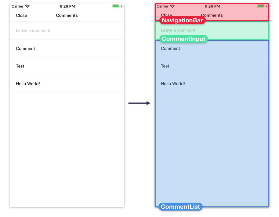
NavigationBar- A simple navigation bar for the top of the screen with a title and a "close" buttonCommentInput- The input field for adding new commentsCommentList- The scrollable list of comments
The App component will be responsible for handling comment data in our app, since both the Feed screen and Comments screen need to render this data. We'll render the Comments screen component from App, passing the comment data for the selected card as a prop. We'll render the built-in Modal component to open and close this new screen based on the state of App.
We'll continue building bottom-up, starting with the CommentInput component, working our way up to the screen component. We won't test every component individually by rendering it from App like we did in the first half of the chapter, but you're welcome to continue to do this if you liked having a quicker feedback loop while developing.
CommentInput
First, let's create the input field for new comments.
TextInput
As we saw in the "Getting Started" chapter, we can use a TextInput component to create an editable text field for the user to type in.
When working with TextInput, we'll generally use the following props to capture user input:
value- The current text in the input field.onChangeText- A function called each time the text changes. The new value is the first argument.onSubmitEditing- A function called when the user presses the return/next key to submit/move to the next field.
It's common to store the current text in the state of the component that renders the TextInput. Each time the function we pass to onChangeText is called, we call setState to update the current text. When the user presses return, the function we passed to onSubmitEditing is called -- we can then perform some action with the current text, and use setState to reset the current text to the empty string.
Common TextInput props and styles
When working with TextInput, we can use most of the same styles as Text (which includes the styles for View). A few styles don't work quite as well as they do on Text though: borders tend not to render correctly, and padding and line height can conflict in unusual ways. If you're having trouble styling a TextInput, you may want to wrap the TextInput in a View and style the View instead.
A few other common props:
autoCapitalize- For capitalizing characters as they're typed. One of'none','sentences','words','characters'.autoCorrect- Enable/disable auto-correct.editable- Enable/disable the text field.keyboardType- The type of keyboard to display. Cross-platform values are'default','numeric','email-address','phone-pad'.multiline- Allow multiple lines of input text.placeholder- The text to show when the text field is emptyplaceholderTextColor- The color of the placeholder textreturnKeyType- The text of the return key on the keyboard. Cross-platform values are'done','go','next','search','send'.
Many more props are available in the docs for TextInput
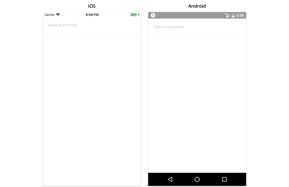
Adding TextInput to CommentList
While we could render a TextInput component directly from our Comments screen, it's often better to create a wrapper component that encapsulates state, styles, edge cases, etc, and has a smaller API. That's what we'll do in our CommentInput component. The result will be very similar to our TextInput wrapper components from previous chapters.
Create a new file, CommentInput.js, in the components directory. We'll import the usual React, PropTypes, etc, along with the TextInput component:
import { StyleSheet, TextInput, View } from 'react-native';
import PropTypes from 'prop-types';
import React from 'react';
We want this component to have two props:
onSubmit- we'll call this with the comment text when the user presses the "return" key.placeholder- a passthrough to theplaceholderprop of theTextInput.
Add the following to CommentInput.js:
// ...

export default class CommentInput extends React.Component {
  static propTypes = {
    onSubmit: PropTypes.func.isRequired,
    placeholder: PropTypes.string,
  };

  static defaultProps = {
    placeholder: '',
  };

  // ...
}

// ...
We'll add a text value to state and methods for updating this value when the value of the TextInput changes:
  state = {
    text: '',
  };

  handleChangeText = text => {
    this.setState({ text });
  };

  handleSubmitEditing = () => {
    const { onSubmit } = this.props;
    const { text } = this.state;

    if (!text) return;

    onSubmit(text);
    this.setState({ text: '' });
  };
We don't want to allow empty comments, so when handleSubmitEditing is called, we'll return immediately if state.text is empty.
Last, we'll render the TextInput. We want to add a border on the bottom, but adding borders to TextInput can be a bit unreliable as sometimes they don't show up. So we'll wrap the TextInput in a View and style the View instead:
  render() {
    const { placeholder } = this.props;
    const { text } = this.state;

    return (
      <View style={styles.container}>
        <TextInput
          style={styles.input}
          value={text}
          placeholder={placeholder}
          underlineColorAndroid="transparent"
          onChangeText={this.handleChangeText}
          onSubmitEditing={this.handleSubmitEditing}
        />
      </View>
    );
  }
const styles = StyleSheet.create({
  container: {
    borderBottomWidth: StyleSheet.hairlineWidth,
    borderBottomColor: 'rgba(0,0,0,0.1)',
    paddingHorizontal: 20,
    height: 60,
  },
  input: {
    flex: 1,
  },
});
This is where we pass our state management methods handleChangeText and handleSubmitEditing to the TextInput, to keep track of changes to the value.
We can use StyleSheet.hairlineWidth as the border width to render the thinnest possible line on any given device. On a retina device for example, this would be less than 1.
If you want to see what this component looks like to check your work, consider rendering it from within
Appfor testing.
CommentList
Next, we'll render a list of comments for each image:
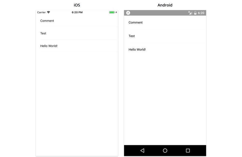
We'll render these comments in a ScrollView. In reality, we'd probably want to use a FlatList for performance, but let's use a ScrollView for practice.
ScrollView
The ScrollView is simpler than the FlatList: it will render all of its children in a vertically or horizontally scrollable list, without the additional complexity of the keyExtractor or renderItem props.
The ScrollView is well suited for scrolling through small quantities of content (fewer than 20 items or so). Content within a ScrollView is rendered even when it isn't visible on the screen. For large quantities of items, or cases where many children of the ScrollView are offscreen, you will likely want to use a FlatList component for better performance.
ScrollView dimensions and layout
You can think of a ScrollView as two separate views, one inside the other. The outer view has a bounded size, while the inner view can exceed the size of the outer view. If the inner view exceeds the size of the outer view, only a portion of it will be visible. When we pass children elements to the ScrollView, they are rendered inside this inner view. We call the inner view the "content container view", and can style it separately from the outer view.
Debugging a
ScrollViewWhile building an app, it's common to render a
ScrollViewbut see nothing on the screen. There are two common causes for this, based on how the outer view and the content container view work (assuming vertical scrolling):
- The content container view has
flex: 0by default, so it starts with aheightof0and expands to the minimum size needed to contain its children elements. If a child hasflex: 1, this child won't be visible, since the content container has an intrinsicheightof0. While we could set thecontentContainerStyletoflex: 1, this probably isn't what we want, since then we'll never have content larger than the outer view. Instead, we should make sure the children we pass to theScrollViewhave intrinsicheightvalues greater than0(either by using an explicitheight, or by containing children that haveheightgreater than0).- The outer view does not change size based on the content container view. In addition to ensuring that the children of a
ScrollViewhave non-zeroheight, we have to make sure ourScrollViewhas non-zero dimensions -- a fixedwidthandheight,flex: 1and a parent withalignItems: stretch, or absolute positioning.Most likely, if the
ScrollViewdoesn't appear, we need to addflex: 1to each parent and to theScrollViewitself. To debug, you can try setting a background color on each parent to see whereflex: 1stopped getting propagated down the component hierarchy.
Adding ScrollView to CommentList
Let's render a ScrollView that contains a list of comments. We'll call this component CommentList.
Create a file CommentList.js in the components directory.
This component will take an items array prop of comment strings, mapping these into View and Text elements. We'll set up the outline for this component in CommentList.js as follows:
import { ScrollView, StyleSheet, Text, View } from 'react-native';
import PropTypes from 'prop-types';
import React from 'react';

export default class CommentList extends React.Component {
  static propTypes = {
    items: PropTypes.arrayOf(PropTypes.string).isRequired,
  };

  // ...
}
Unlike FlatList, we don't need to deal with the keyExtractor and data props. We can simply render the children of the ScrollView as we would for a View:
  renderItem = (item, index) => (
    <View key={index} style={styles.comment}>
      <Text>{item}</Text>
    </View>
  );

  render() {
    const { items } = this.props;

    return <ScrollView>{items.map(this.renderItem)}</ScrollView>;
  }
const styles = StyleSheet.create({
  comment: {
    marginLeft: 20,
    paddingVertical: 20,
    paddingRight: 20,
    borderBottomWidth: StyleSheet.hairlineWidth,
    borderBottomColor: 'rgba(0,0,0,0.05)',
  },
});
Since comments are stored as strings, we don't have a convenient value to use as the unique React
key. Using the comment text as thekeywouldn't work, since comments don't have to be unique. Using theindexas the key works here, but is generally a pattern to be wary of, since it can cause problems when rearranging items. A better solution would be to augment our comment data with ids: we could store comments as objects, and use theuuidlibrary from the previous chapter to assign each comment a unique id for use as the key.
Now that we have a scrolling list of comments, we can move on to the navigation bar, which will be the last component we make before assembling our comments screen.
NavigationBar
Since our comments screen is going to open in a modal, we want to render a navigation bar with a title and close button.
In a real app, we would likely use a navigation library for this, but for simplicity, let's write something small of our own.
Create NavigationBar.js in the components directory and add the following outline:
import {
  StyleSheet,
  Text,
  TouchableOpacity,
  View,
} from 'react-native';

export default function NavigationBar({
  title,
  leftText,
  onPressLeftText,
}) {
  // ...
}

NavigationBar.propTypes = {
  title: PropTypes.string,
  leftText: PropTypes.string,
  onPressLeftText: PropTypes.func,
};

NavigationBar.defaultProps = {
  title: '',
  leftText: '',
  onPressLeftText: () => {},
};

// ...
We won't use
isRequiredon our props, since this component would likely be used without some of them, e.g.leftTextandonPressLeftText, if we were to add more screens to this app.
This component will be fairly straightforward, using only concepts we've covered already. We'll use a TouchableOpacity for the close button on the left. We'll position it with position: 'absolute', since we don't want the text on the left to push the title off-center (remember, using position: 'absolute' means the component no longer affects other siblings in the layout). A real navigation library takes into account many more cases such as text on the right, icons on either side, and long text that may bump into the title. Let's keep things simple and just handle the one case at hand.
The component function and styles should look like this:
export default function NavigationBar({
  title,
  leftText,
  onPressLeftText,
}) {
  return (
    <View style={styles.container}>
      <TouchableOpacity
        style={styles.leftText}
        onPress={onPressLeftText}
      >
        <Text>{leftText}</Text>
      </TouchableOpacity>
      <Text style={styles.title}>{title}</Text>
    </View>
  );
}
const styles = StyleSheet.create({
  container: {
    height: 40,
    borderBottomWidth: StyleSheet.hairlineWidth,
    borderBottomColor: 'rgba(0,0,0,0.1)',
    alignItems: 'center',
    justifyContent: 'center',
  },
  title: {
    fontWeight: '500',
  },
  leftText: {
    position: 'absolute',
    left: 20,
    top: 0,
    bottom: 0,
    justifyContent: 'center',
  },
});
Despite generally representing a numeric value,
fontWeightmust be a string!
We now have all of the building blocks we need: CommentInput, CommentList, and NavigationBar. Let's assemble them in a new screen.
Comments screen
This page is a preview of Fullstack React Native: The Complete Guide to Building Beautiful React Native Apps
Get the rest of this chapter plus hundreds of pages of React instruction, 4 sample projects, a screencast, and more.