
Core APIs, Part 1
So far we've primarily used React components to interact with the underlying native APIs -- we've used components like View, Text, and Image to create native UI elements on the screen.
React provides a simple, consistent interface for APIs which create visual components. Some APIs don't create UI components though: for example, accessing the Camera Roll, or querying the current network connectivity of the device.
React Native also comes with APIs for interacting with these non-visual native APIs. In contrast with components, these APIs are generally imperative functions: we must call them explicitly at the right time, rather than returning something from a component's render function and letting React call them later. React Native simply provides us a JavaScript wrapper, often cross-platform, for controlling the underlying native APIs.
Building a messaging app
In this chapter, we'll build the start of a messaging app (similar to iMessage) that gives us a tour of some of the most common core APIs. Our app will let us send text, send photos from the camera roll, and share our location. It will let us know when we are disconnected from the network. It will handle keyboard interactions and the back button on Android.
To try the completed app:
-
On Android, you can scan the following QR code from within the Expo app:

-
On iOS, you can navigate to the
messaging/directory within our sample code folder and build the app. You can either preview it using the iOS simulator or send the link of the project URL to your device as we mentioned in the first chapter.
We can send text messages, images, and maps:
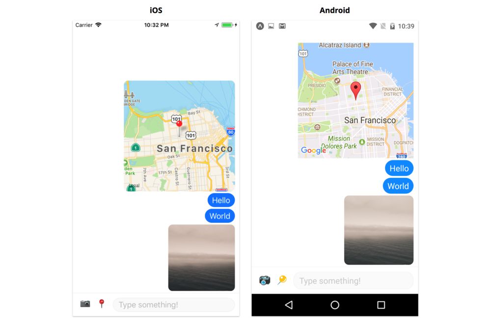
We can choose images from our device camera roll:
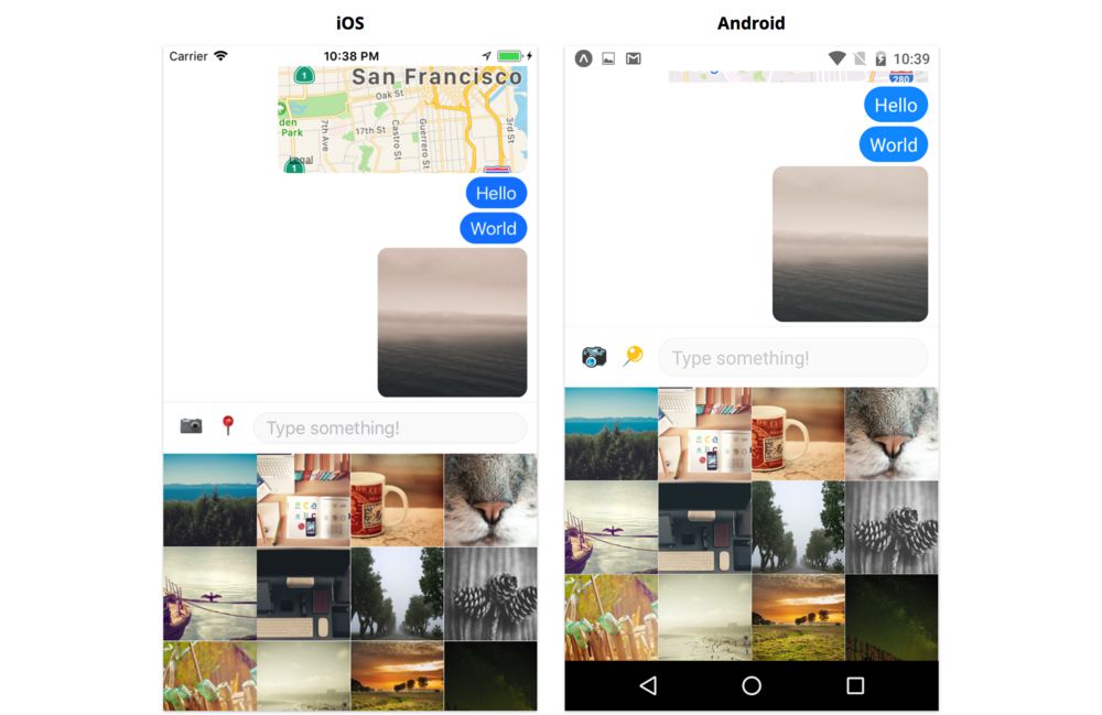
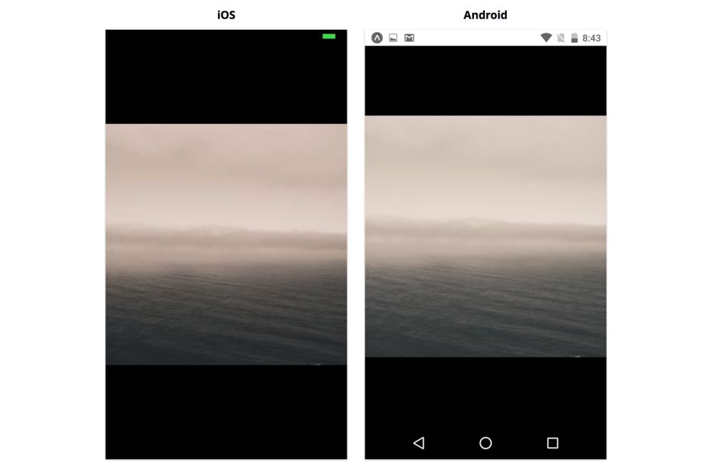
And we can view images fullscreen:
We'll use the following APIs:
Alert- Displays modal dialog windows for simple user inputBackHandler- Controls the back button on AndroidCameraRoll- Returns images and videos stored on the deviceDimensions- Returns the dimensions of the screenGeolocation- Returns the location of the device, and emits events when the location changesKeyboard- Emits events when the keyboard appears or disappearsNetInfo- Returns network connectivity information, and emits events when the connectivity changesPixelRatio- Translates from density-independent pixels to density-dependent pixels (more detail on this later)StatusBar- Controls the visibility and color of the status bar
We'll just be focusing on the UI, so we won't actually send messages, but we could connect the UI we build to a backend if we wanted to use it in a production app.
Initializing the project
Just as we did in the previous chapters, let's create a new app with the following command:
$ expo init messaging --template blank@sdk-33 --yarn
Once this finishes, navigate into the messaging directory.
In this chapter we'll create the utils directory ourselves, so there's no need to copy over the sample code. We do however want to install a few additional node modules. Install expo-constants, expo-permissions, and react-native-maps using the following command:
$ yarn add expo-constants expo-permissions react-native-maps
The app
Let's start by setting up the skeleton of the app. We'll do this in App.js. After that, we'll build out the different parts of the screen, one component at a time. We'll tackle keyboard handling last, since that's the most difficult and intricate.
We'll follow the same general process as in the previous chapters: we'll start by breaking down the screen into components, building a hardcoded version, adding state, and so on.
The app's skeleton
If we look at the app from top to bottom, these are the main sections of the UI:
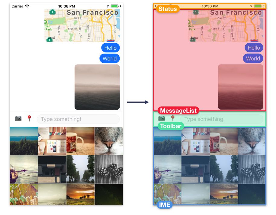
Status- The device generally renders a status bar, the horizontal strip at the top of the screen that shows time, battery life, etc -- but in this case, we'll augment it to show network connectivity more prominently. We'll create our own component,Status, which renders beneath the device's status bar.MessageList- This is where we'll render text messages, images, and maps.Toolbar- This is where the user can switch between sending text, images, or location, and where the input field for typing messages lives.- Input Method Editor (IME) - This is where we can render a custom input method, i.e. sending images. We'll build an image picker component,
ImageGrid, and use it here. Note that the keyboard is rendered natively by the operating system, so we will trigger the keyboard to appear and disappear at the right times, but we won't render it ourselves.
In this chapter we'll be building top-down. We'll start by representing the message list, the toolbar, and the IME with a placeholder View. By starting with a rough layout, we can then create components for each section, putting each one in its respective View. Each section will be made up of a few different components.
Open App.js and add the following skeleton:
import { StyleSheet, View } from 'react-native';
import React from 'react';

export default class App extends React.Component {
  renderMessageList() {
    return (
      <View style={styles.content}></View>
    );
  }

  renderInputMethodEditor() {
    return (
      <View style={styles.inputMethodEditor}></View>
    );
  }

  renderToolbar() {
    return (
      <View style={styles.toolbar}></View>
    );
  }

  render() {
    return (
      <View style={styles.container}>
        {this.renderMessageList()}
        {this.renderToolbar()}
        {this.renderInputMethodEditor()}
      </View>
    );
  }
}

const styles = StyleSheet.create({
  container: {
    flex: 1,
    backgroundColor: 'white',
  },
  content: {
    flex: 1,
    backgroundColor: 'white',
  },
  inputMethodEditor: {
    flex: 1,
    backgroundColor: 'white',
  },
  toolbar: {
    borderTopWidth: 1,
    borderTopColor: 'rgba(0,0,0,0.04)',
    backgroundColor: 'white',
  },
});
When you save App.js, the app should reload on your device and you'll see the following:
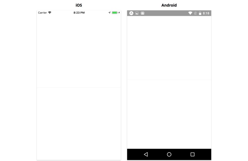
Awesome, a blank screen with a small gray line through the middle! Now we can start building out the different sections of the screen. The App component will orchestrate how data is populated, and when to hide or show the various input methods -- but first, we need to start creating the different components in the UI.
Now's a good time to create a new directory, components, within our main messaging directory. We'll put the UI components we build in the components directory.
Network connectivity indicator
Since we're building a messaging app, network connectivity is relevant at all times. Let's let the user know when they've lost connectivity by turning the status bar red and displaying a short message.
StatusBar
Many apps display the default status bar, but sometimes we want to customize the style, e.g. turning the background red.
The status bar works a little differently on iOS and Android. On iOS the status bar background is always transparent, so we can render content behind the status bar text. On Android, we can set the status bar background to transparent, or to a specific solid color. If we use a transparent status bar, we can render content behind it just like on iOS -- unlike on iOS, by default the status bar text is white and there's typically a semi-transparent black background. If we choose a solid color status bar, our app's content renders below the status bar, and the height of our UI will be a little smaller. In our app, we'll use a solid color status bar, since this will let us customize the color.
To use a solid color status bar, we need to open up app.json and add the following to the expo object (although you can skip this if you're not using an Android):
"expo": {
  // ...
  "androidStatusBar": {
    "barStyle": "dark-content",
    "backgroundColor": "#FFFFFF"
  }
}
Let's restart the packager with npm run start to make sure this change takes effect.
If we had used
react-native initinstead ofexpo init, we wouldn't need to do this. Expo handles the status bar specially. You can check out the guide on configuring the status bar for more detail.
On both platforms, we can set the status bar text color by using the built-in StatusBar component and passing a barStyle of either light-content (white text) or dark-content (black text).
There are two different ways we can use StatusBar: imperatively and as a component. In this example we'll use the component approach.
Create a new file Status.js in the components directory now.
Status styles
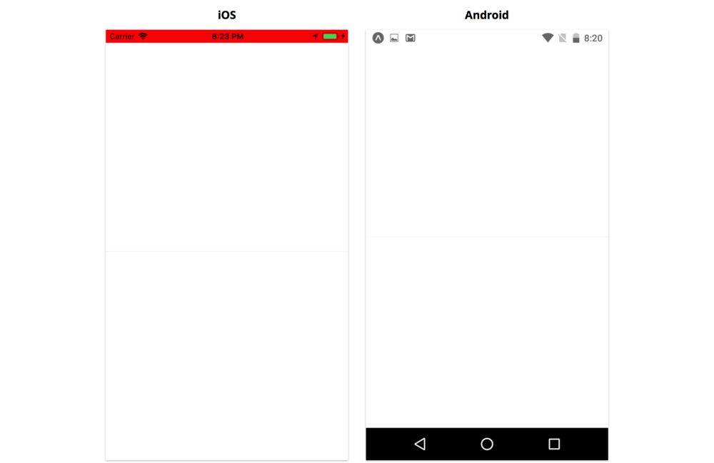
Let's first start with the background styles. We need to create a View that sits behind the text of the status bar -- on iOS, rendering the background color of the status bar is our responsibility, since the operating system only renders the status bar text.
We'll have two visual states: one where the user is connected to the network, and one where the user is disconnected. We'll set the color for each state in render, so let's start with the base style for the status bar:
import Constants from 'expo-constants';
import { StyleSheet } from 'react-native';

// ...

const statusHeight =
  (Platform.OS === 'ios' ? Constants.statusBarHeight : 0);

const styles = StyleSheet.create({
  status: {
    zIndex: 1,
    height: statusHeight,
  },
  // ...
});
The base style status will give the View its height. The View will have the same height regardless of whether this component is in the connected or disconnected state. We use a zIndex of 1 to indicate that this View should be drawn on top of other content -- this will be relevant later, since we're going to render a ScrollView beneath it.
Depending on the component's state, we'll then pass a style object containing a background color (in addition to passing the status style).
We'll store the network connectivity status in component state as state.isConnected. If state.isConnected is true then the device is connected to the internet, and if it's false then the device is disconnected. We'll set isConnected to true by default, since that's the most likely case, and since it would be a poor user experience to show a connectivity message when it's not needed.
Let's try rendering this background View.
import Constants from 'expo-constants';
import {
  NetInfo,
  Platform,
  StatusBar,
  StyleSheet,
  Text,
  View,
} from 'react-native';
import React from 'react';

export default class Status extends React.Component {
  state = {
    isConnected: null,
  };

  // ...

  render() {
    const { isConnected } = this.state;

    const backgroundColor = isConnected ? 'white' : 'red';

    if (Platform.OS === 'ios') {
      return (
        <View style={[styles.status, { backgroundColor }]}></View>
      );
    }

    return null; // Temporary!
  }
}

// ...
Notice how we use an array for the View to apply two styles: the status style, and then a style object containing a different background color depending on whether we're connected to the network or not.
Let's save Status.js and import it from App.js so we can see what we have so far.
We can now go ahead and render our new Status component from App:
// ...
import Status from './components/Status';
export default class App extends React.Component {
// ...
render() {
return (
<View style={styles.container}>
<Status />
{this.renderMessageList()}
{this.renderToolbar()}
{this.renderInputMethodEditor()}
</View>
);
}
// ...
}
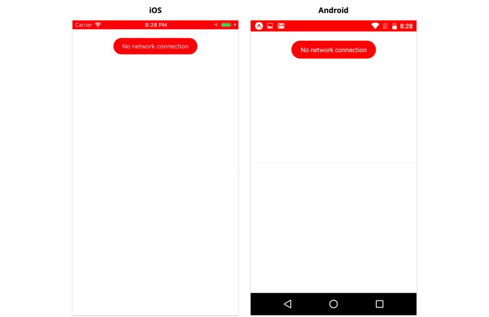
// ...
We shouldn't see anything yet... but to verify that everything is working, you can temporarily set isConnected: 'false' in the state of Status. This will show a red background behind the status bar text.
Doing this, we should see:
Using StatusBar
The black text on the red background doesn't look very good. This is where the StatusBar component comes in. Let's import it from react-native and render it within our View.
import Constants from 'expo-constants';
import { StatusBar, StyleSheet, View } from 'react-native';
import React from 'react';

export default class Status extends React.Component {
  state = {
    isConnected: true,
  };

  // ...

  render() {
    const { isConnected } = this.state;

    const backgroundColor = isConnected ? 'white' : 'red';

    const statusBar = (
      <StatusBar
        backgroundColor={backgroundColor}
        barStyle={isConnected ? 'dark-content' : 'light-content'}
        animated={false}
      />
    );

    if (Platform.OS === 'ios') {
      return (
        <View style={[styles.status, { backgroundColor }]}>
          {messageContainer}
        </View>
      );
    }

    return null; // Temporary!
  }
}
Here we set barStyle to dark-content if we're connected (black text on our white background) and light-content if we're disconnected (white text on our red background). We set backgroundColor to set the correct background color on Android. We also set animated to false -- since we're not animating the background color on iOS, animating the text color won't look very good.
Note that the StatusBar component doesn't actually render the status bar text. We use this component to configure the status bar. We can render the StatusBar component anywhere in the component hierarchy of our app to configure it, since the status bar is configured globally.
We can even render StatusBar in multiple different components, e.g. we could render it from App.js in addition to Status.js. If we do this, the props we set as configuration are merged in the order the components mount. In practice it can be a bit hard to follow the mount order, so it may be easier to use the imperative API if you find yourself with many StatusBar components (more on this later).
Message bubble
Since the red status bar alone doesn't indicate anything about network connectivity, let's also add a short message in a floating bubble at the top of the screen.
This page is a preview of Fullstack React Native: The Complete Guide to Building Beautiful React Native Apps
Get the rest of this chapter plus hundreds of pages of React instruction, 4 sample projects, a screencast, and more.