
Using Presentational and Container Components with Redux
In the last chapter, we added complexity to both the state as well as the view-layer of our application. To support threads in our app, we nested message objects inside of thread objects in our state tree. By using reducer composition, we were able to break up the management of our more complex state tree into smaller parts.
We added a new React component to support our threaded model, ThreadTabs, which lets the user switch between threads on the view. We also added some complexity to existing components.
At the moment, we have four React components in our app. Every React component interacts directly with the Redux store. App subscribes to the store and uses getState() to read the state and passes down this state as props to its children. Child components dispatch actions directly to the store.
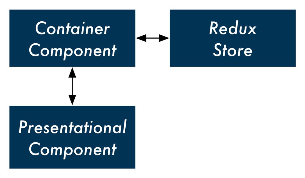
In this chapter, we'll explore a new paradigm for organizing our React components. We can divide up our React components into two types: presentational components and container components. We'll see how doing so limits knowledge of our Redux store to container components and provides us with flexible and re-usable presentational components.
Presentational and container components
In React, a presentational component is a component that just renders HTML. The component's only function is presentational markup. In a Redux-powered app, a presentational component does not interact with the Redux store.
The presentational component accepts props from a container component. The container component specifies the data a presentational component should render. The container component also specifies behavior. If the presentational component has any interactivity — like a button — it calls a prop-function given to it by the container component. The container component is the one to dispatch an action to the Redux store:
Take a look at the ThreadTabs component:
class ThreadTabs extends React.Component {
  handleClick = (id) => {
    store.dispatch({
      type: 'OPEN_THREAD',
      id: id,
    });
  };

  render() {
    const tabs = this.props.tabs.map((tab, index) => (
      <div
        key={index}
        className={tab.active ? 'active item' : 'item'}
        onClick={() => this.handleClick(tab.id)}
      >
        {tab.title}
      </div>
    ));
    return (
      <div className='ui top attached tabular menu'>
        {tabs}
      </div>
    );
  }
}
At the moment, this component both renders HTML (the text field input) and communicates with the store. It dispatches the OPEN_THREAD action whenever a tab is clicked.
But what if we wanted to have another set of tabs in our app? This other set of tabs would probably have to dispatch another type of action. So we'd have to write an entirely different component even though the HTML it renders would be the same.
What if we instead made a generic tabs component, say Tabs? This presentational component would not specify what happens when the user clicks a tab. Instead, we could wrap it in a container component wherever we want this particular markup in our app. That container component could then specify what action to take by dispatching to the store.
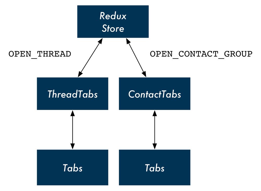
We'll call our container component ThreadTabs. It will do all of the communicating with the store and let Tabs handle the markup. In the future, if we wanted to use tabs elsewhere — say, in a "contacts" view that has a tab for each group of contacts — we could re-use our presentational component:
Splitting up ThreadTabs
We'll split up ThreadTabs by first writing the presentational component Tabs. This component will only be concerned with rendering the HTML — the array of horizontal tabs. It will also expect a prop, onClick. The presentational component will allow its container component to specify whatever behavior it wants when a tab is clicked.
Let's add Tabs to App.js now. Write it above the current ThreadTab component. The JSX for the HTML markup is the same as before:
const Tabs = (props) => (
  <div className='ui top attached tabular menu'>
    {
      props.tabs.map((tab, index) => (
        <div
          key={index}
          className={tab.active ? 'active item' : 'item'}
          onClick={() => props.onClick(tab.id)}
        >
          {tab.title}
        </div>
      ))
    }
  </div>
);
A unique aspect of our new presentational component is how it's declared. So far, we've been using ES6 classes like this:
class App extends React.Component {
  // ...
}
React components declared in this manner are wrapped in React's component API. This declaration gives the component all of the React-specific features that we've been using, like lifecycle hooks and state management.
However, as we cover in the "Advanced Components" chapter, React also allows you to declare stateless functional components. Stateless functional components, like Tabs, are just JavaScript functions that return markup. They are not special React objects.
Because Tabs does not need any of React's component methods, it can be a stateless component.
In fact, all our presentational components can be stateless components. This reinforces their single responsibility of rendering markup. The syntax is terser. What's more, the React core team recommends using stateless components whenever possible. Because these components are not "dressed up" with any of the capabilities of React component objects, the React team anticipates there will be many performance advantages introduced for stateless components in the near future.
As we can see, the first argument passed in to a stateless component is props:
const Tabs = (props) => (
Because Tabs is not a React component object, it does not have the special property this.props. Instead, parents pass props to stateless components as an argument. So we'll access this component's props everywhere using props as opposed to this.props.
Our map call for
Tabsis in-line, nested inside of thedivtag in the function's return value.You could also put this logic above the function's return statement, like we had before in the
renderfunction ofThreadTabs. It's a matter of stylistic preference.
Our presentational component is ready. Let's see what the container component that uses it looks like. Modify the current ThreadTabs component:
class ThreadTabs extends React.Component {
  render() {
    return (
      <Tabs
        tabs={this.props.tabs}
        onClick={(id) => (
          store.dispatch({
            type: 'OPEN_THREAD',
            id: id,
          })
        )}
      />
    );
  }
}
Although we don't use any of React's component methods, we're still using an ES6 class component as opposed to declaring a stateless component. We'll see why in a moment.
Our container component specifies the props and behavior for our presentational component. We set the prop tabs to this.props.tabs, specified by App. Next, we set the prop onClick to a function that calls store.dispatch(). We expect Tabs to pass the id of the clicked tab to this function.
If we were to test the app out now, we'd be happy to note that our new container/presentational component combination is working.
However, there's one odd thing about ThreadTabs: It sends actions to the store directly with dispatch, yet at the moment it's reading from the store indirectly through props (through this.props.tabs). App is the one reading from the store and this data trickles down to ThreadTabs. But if ThreadTabs is dispatching directly to the store, is this indirection for reading from the store necessary?
Instead, we can have all of our container components be responsible for both sending actions to the store and reading from it.
In order to achieve this with ThreadTabs, we can subscribe directly to the store in componentDidMount, the same way that App does:
class ThreadTabs extends React.Component {
  componentDidMount() {
    store.subscribe(() => this.forceUpdate());
  }
Then, inside of render, we can read state.threads directly from the store with getState(). We'll generate tabs here using the same logic that we used in App:
  render() {
    const state = store.getState();

    const tabs = state.threads.map(t => (
      {
        title: t.title,
        active: t.id === state.activeThreadId,
        id: t.id,
      }
    ));
Now we don't need to read from this.props at all. We pass Tabs the tabs variable that we created:
    return (
      <Tabs
        tabs={tabs}
        onClick={(id) => (
          store.dispatch({
            type: 'OPEN_THREAD',
            id: id,
          })
        )}
      />
    );
Our Tabs component is purely presentational. It specifies no behavior of its own and could be dropped-in anywhere in the app.
The ThreadTabs component is a container component. It renders no markup. Instead, it interfaces with the store and specifies which presentational component to render. The container component is the connector of the store to the presentational component.
Our presentational and container component combination, in full:
const Tabs = (props) => (
  <div className='ui top attached tabular menu'>
    {
      props.tabs.map((tab, index) => (
        <div
          key={index}
          className={tab.active ? 'active item' : 'item'}
          onClick={() => props.onClick(tab.id)}
        >
          {tab.title}
        </div>
      ))
    }
  </div>
);

class ThreadTabs extends React.Component {
  componentDidMount() {
    store.subscribe(() => this.forceUpdate());
  }

  render() {
    const state = store.getState();

    const tabs = state.threads.map(t => (
      {
        title: t.title,
        active: t.id === state.activeThreadId,
        id: t.id,
      }
    ));

    return (
      <Tabs
        tabs={tabs}
        onClick={(id) => (
          store.dispatch({
            type: 'OPEN_THREAD',
            id: id,
          })
        )}
      />
    );
  }
}
In addition to the ability to re-use our presentational component elsewhere in the app, this paradigm gives us another significant benefit: We've de-coupled our presentational view code entirely from our state and its actions. As we'll see, this approach isolates all knowledge of Redux and our store to our app's container components. This minimizes the switching costs in the future. If we wanted to move our app to another state management paradigm, we wouldn't need to touch any of our app's presentational components.
Splitting up Thread
Let's continue refactoring with our new design pattern.
Thread receives the thread as a prop and contains all the markup for rendering the messages inside of that thread as well as MessageInput. The component will dispatch to the store a DELETE_MESSAGE action if a message is clicked.
Part of rendering the view for a thread involves rendering the view for its messages. We could have separate container and presentational components for threads and messages. In this setup, the presentational component for a thread would render the container component for a message.
But because we don't anticipate ever rendering a list of messages outside of a thread, it's reasonable to just have the container component for the thread also manage the presentational component for a message.
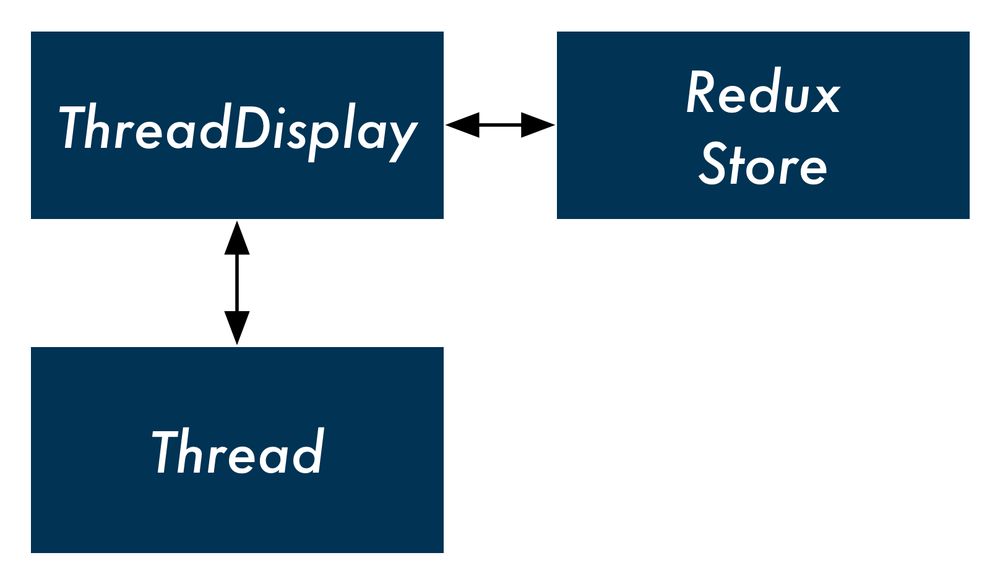
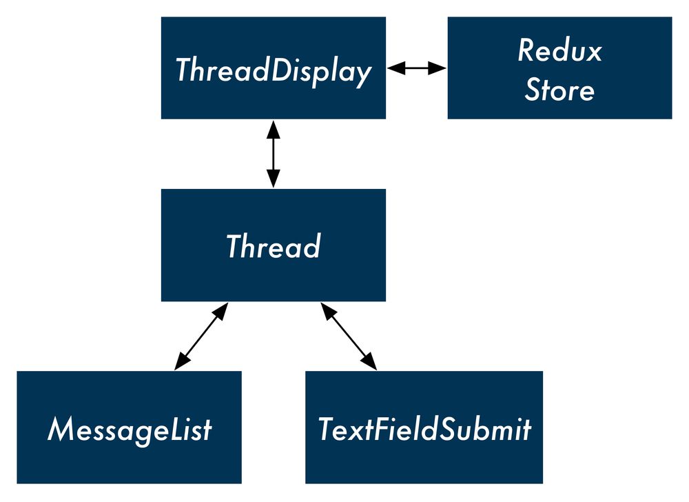
We can have one container component, ThreadDisplay. This container component will render the presentational component Thread:
For the list of messages, we can have Thread render another presentational component, MessageList.
But what about the component MessageInput? Like our previous version of ThreadTabs, the component contains two responsibilities. The component renders markup, a single text field with a submit button. In addition, it specifies the behavior for what should happen when the form is submitted.
We could, instead, just have a generic presentational component. TextFieldSubmit only renders markup and allows its parent to specify what happens when the text field is submitted. ThreadDisplay, through Thread, could control the behavior of this text field.
With this design, we'd have one container component for a thread up top. The presentational component Thread would be a composite of two child presentational components, MessageList and TextFieldSubmit:
Let's first rename our current Thread component to ThreadDisplay to avoid confusion:
// Rename from `Thread`
class ThreadDisplay extends React.Component {
  // ...
};
We'll begin at the bottom, writing the presentational components TextFieldSubmit and MessageList. We'll work our way up to Thread and then ThreadDisplay.
TextFieldSubmit
Like with ThreadTabs, MessageInput has two distinct roles: the component both renders the HTML for an input field but also specifies what the behavior around submitting that input field should be (dispatching ADD_MESSAGE).
If we remove the dispatch call from MessageInput, we'd be left with a generic component that just rendered markup: a text field with an adjacent submit button. The presentational component will allow its container component to specify whatever behavior it wants when the input field is submitted.
Let's rename MessageInput to TextFieldSubmit to make it more generic. The only additional change we need to make is in handleSubmit(). We'll have TextFieldSubmit expect a single prop, onSubmit. Instead of dispatching to the store directly, it will invoke this prop-function:
class TextFieldSubmit extends React.Component {
  state = {
    value: '',
  };

  onChange = (e) => {
    this.setState({
      value: e.target.value,
    })
  };

  handleSubmit = () => {
    this.props.onSubmit(this.state.value);
    this.setState({
      value: '',
    });
  };
MessageList
The MessageList component will accept two props: messages and onClick. As before, this presentational component will not specify any behavior. As a stateless component, it will only render HTML.
Write it below TextFieldSubmit and above the ThreadDisplay component in App.js:
const MessageList = (props) => (
  <div className='ui comments'>
    {
      props.messages.map((m, index) => (
        <div
          className='comment'
          key={index}
          onClick={() => props.onClick(m.id)}
        >
          <div className='text'>
            {m.text}
            <span className='metadata'>@{m.timestamp}</span>
          </div>
        </div>
      ))
    }
  </div>
);
The map that we perform over props.messages is the same logic we had previously in Thread. We perform it in-line, nested inside of the div tag which is responsible for styling. The three changes:
- We perform the map over
props.messagesas opposed tothis.props.threads - The
onClickattribute is now set toprops.onClick - For brevity, we're using the variable
min place ofmessage
You could optionally break this presentational component down further by adding another component,
Message. The markup for each message is still simple enough that we opted not to do this just yet here.
Thread
We have two presentational components related to displaying a thread. One is MessageList, which renders all of the messages in that thread. The other is TextFieldSubmit, a generic text field entry that we're going to have submit new messages to the thread.
We're collecting these two presentational components under Thread, another presentational component. The container component ThreadDisplay will render Thread which in turn will render MessageList and TextFieldSubmit.
We anticipate that ThreadDisplay will pass Thread three props:
thread: The thread itselfonMessageClick: The message click handleronMessageSubmit: The text field submit handler
We'll have Thread pass along the appropriate props to each of its child presentational components:
const Thread = (props) => (
  <div className='ui center aligned basic segment'>
    <MessageList
      messages={props.thread.messages}
      onClick={props.onMessageClick}
    />
    <TextFieldSubmit
      onSubmit={props.onMessageSubmit}
    />
  </div>
);
This page is a preview of Fullstack React: The Complete Book on ReactJS and Friends.
Get the rest of this chapter plus hundreds of pages of React instruction, 5 sample projects, a screencast, and more.